• PROJECTS
  • ABOUT
Menu

T A R R  C R E A T I V E

  • PROJECTS
  • ABOUT

DÖKK CHOCOLATE BARS

Packaging design & hand-drawn illustrations for the first line of Stockholm-based Dökk Confectioner's chocolate bars

-

Emulating the romantic and quirky essences of the eight varieties, I created a look that is simultaneously classic and playful. In a similar juxtaposition, the hand-drawn illustrative elements are paired with the clean typography. 


Model Credit: Nathan Bailey

choc3.jpg
choc5.jpg
choc4.jpg
choc1.jpg
choc2.jpg
choc7.jpg
choc6.jpg
choc8.jpg

5% DAY | STUDIO THEATRE

BRANDING | LOGO DESIGN | COLLATERAL DESIGN

As Whole Foods Market prepared to merge with Amazon in 2017, I re-branded several programs and initiatives to better fit the new MODERN + ORGANIC branding style.

—

The 5% Day logo was designed to be modern, simple, and bold. Distinct from the more organic and earthy Whole Foods Market signage, the 5% Day branding stands out in the stores and helps draw attention to this charitable initiative. Green is a frequently used color in Whole Foods Market collateral so I chose a complimentary shade of red as an accent to the simple black or white logo.

The first recipient of funds raised by 5% Day after the rebrand was Studio Theatre. Using Studio Theatre’s photos and information, I created easily customizable poster templates to be used in stores for future beneficiaries.

Additionally, I created a series of one-time-use social media imagery for Whole Foods Market accounts that merged Studio Theatre’s branding with the new 5% Day branding.

5%_LOGO.jpg
5%_DAY_NEW_problem_2.jpg
5%_studio_theatre1.jpg
5%_studio_theatre2.jpg
5%_studio_theatre3.jpg
5%_studio_theatre4.jpg
5%_studio_theatre5.jpg
5%_DAY_NEW_FB_2.jpg

WHOLE FOODS MARKET POSTERS

Design, Art Direction + Photography for series of 11 in-store posters featuring profiles of Team Members from Whole Foods Market P Street

-

The concept of this project was to set Whole Foods Market apart from other grocery stores by highlighting the unique skills  and expertise of Team Members and by creating images that celebrated food and summer. 

Conceptualizing, directing, and carrying out each photo shoot, I maintained the original idea and designed the posters to convey their message through editorial-style photography. Each shoot required detailed planning and prop-preparation (no Photoshop involved in scenes) as well as a relationship with the Team Members in order to obtain a relaxed look. 


This project was awarded first place in the anual Whole Foods Market Look Book Competition

ronnie.jpg
daisy.jpg
tia.jpg
andrew.jpg
martha.jpg
maedot.jpg
tanda.jpg
nelson.jpg
denisha.jpg
escarleth.jpg

TOUR DE PALM SPRINGS

Graphic Design for series of Tour de Palm Springs event posters

Tour de Palm Springs is an annual cycling event in the Coachella Valley area of California. Pairing the dynamic views of the surrounding desert and mountains with the energy and athleticism of the cyclists, I created this series of event posters to represent the beauty and fun of this race.

palm_springs.jpg
palm3.jpg
palm1.jpg

HSH AMBASSADORS

Design + Photography for HSH (Health Starts Here) Ambassador profiles featuring six Team Members from Whole Foods Market P Street in Washington, DC

-

These posters, designed to connect Whole Foods Market P Street with their specific community, are designed to emphasize the portrait. In order to capture these six selected individuals, I spent time getting to know them well prior to the shoots. This resulted in a series of in-store posters that not only shared valuable health tips, but also conveyed warm familiarity to shoppers.

The fonts and color selections were selected with the HSH branding standards in-mind. 

HSH_Ambassador_Posters1.jpg
HSH_Ambassador_Posters2.jpg
HSH_Ambassador_Posters5.jpg
HSH_Ambassador_Posters3.jpg
HSH_Ambassador_Posters4.jpg
HSH_Ambassador_Posters6.jpg

GALLERY WEEKEND BERLIN: SYNKOPIERT

Poster, billboard, and print material designs advertising the Synkopiert event at Gallery Weekend Berlin

-

Uniting itself with the Gallery Weekend Berlin branding while emulating the quirky nature of the music and art event, Synkopiert, this series of designs included an array of materials ranging from small prints to large billboards. I created the background imagery with a series of uncanny doll photos and some experimentation after researching the aesthetics of the participants of the exhibition and the style of the performing artists. The end result captures the experimental spirit of the exhibitions and performances.

Fun story: I often go for a long walk or bike ride when I’m stumped creatively. The day I began working on this project, I stepped out of my flat for one of my “brainstorming walks.” A few blocks away, I noticed a box of discarded items in the trash heap on the street. I almost passed it but was captivated by a vintage doll book sitting on top. I picked it up, flipped through it, saw the image of the doll violinist and was struck by inspiration. I pitched the idea of distorted dolls to the Gallery Weekend Berlin design team and they loved it. This experience reminded me of the importance of keeping an open mind.

synkopiert_1.jpg
synkopiert_2.jpg
synkopiert_3.jpg
synkopiert_4.jpg
synkopiert_5.jpg
skynkopiert_poster1.jpg
synkopiert_poster2.jpg

BERLIN BABY

A personal project in which I designed a font, website, icons, and additional collateral inspired by the birth of my daughter.

-

With the birth of Brontë approaching, I wanted to create a font that I could use in announcements and projects relating to her arrival. The project started out as just the BDT font design, featured here in variations of dummy text. Building upon the style of the font, I designed a temporary website with original photography and icons where our friends and family overseas could send notes or gifts.

berlin_baby_logo.jpg
berlin_baby_mockup.jpg
berlin_baby_icons.jpg
        U P D A T E   |    welcoming, Brontë!

U P D A T E | welcoming, Brontë!

CURIOUS CUISINE

Art Direction, Design + illustration for a $50,000 advertising campaign of the Washington, DC-based food event, including over 10 different ad layouts for specific locations throughout the city

-

During the original brainstorming process with the Whole Foods Market marketing director, we decided to highlight the "curious" nature of the event through fantastical illustrations and an offbeat pop art color palette.

I drew the illustrations by hand, scanned them in, and colored them using Adobe Illustrator in order to achieve a flat surface. The handling of the font is minimal and clean, allowing the illustrations to speak for themselves while providing easy-to-read information for passers-by.


This project was awarded first place in the quarterly Graphic Design competition presented by Whole Foods Market


02cc.jpg
01cc.jpg
5.jpg
1.jpg
2.jpg
4.jpg
3.jpg

EATERS MAGAZINE

Cover Designs + Collage for bi-monthly food publication, EATERS

-

Designed to compliment the contents of EATERS which are filled with eccentric food-related prose, art photography, activism-focused writings, and recipes, I created each issue's cover with a quirky feel and vintage elements. Combining images I photographed with scans of found imagery, the collages teeter between chaos and precision, creating a perfect square shape in whole. The handling of the typefaces repercuss the simplicity of 1960's publication typesetting.


Also pictured: an experimental collage piece I created for the interior of Vol. 1, The Meat Issue. 

jessikatarr_eaters1.jpg
jessikatarr_eaters4.jpg
jessikatarr_eaters3.jpg
jessikatarr_eaters2.jpg
jessikatarr_eaters5.jpg
eaters_jessikatarr9.jpg
short_prayers.jpg

HEALTHY EATING HANDBOOK

Design, Layout + Vector Illustration for the Healthy Eating Handbook carried in all Whole Foods Market stores 

-

Working with nutritionists and marketing directors at Whole Foods Market, I designed this handbook to provide engaging and informative healthy eating tips to customers. Maintaining the branding standards for the Health Starts Here program, I created infograhics and illustrations to compliment the information and photos provided. 25 pages long (including cover and back), the full booklet is available for view here.

jessikatarr_HSH1.jpg
jessikatarr_HSH2.jpg
jessikatarr_HSH3.jpg
WFM-Healthy-Eating-HandBook1.jpg
WFM-Healthy-Eating-HandBook2.jpg

P STREET LOGO

Design for Whole Foods Market P Street, DC logo

-

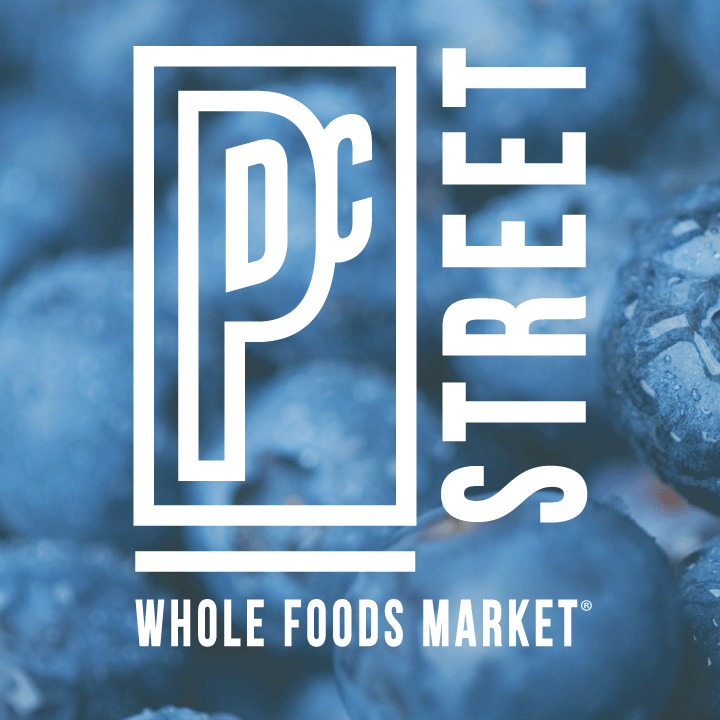
In order to help this specific Whole Foods Market location stand out as a neighborhood store, rather than another branch of the greater corporation, I designed the P Street logo. Created to reflect the urban location, the text and shapes in the logo mimic the shapes seen in the surrounding streets and buildings. The inside of the "P" calls out its location in Washington, DC while the lower subtext subtly connects it to Whole Foods Market. 

Created to be displayed either in white or deep charcoal (depending on its placement), the logo has been used for all branding and promotional materials both in and out of the store since its creation in 2013. 


(pictured both on its own and over top of photographs I took for the store for various projects)

PST_logo_1.jpg
PST_logo_2.jpg
PST_logo_3.jpg

PSYCHOSIS FILM

Key art design for indie film, Psychosis, leading up to its premier at The Sundance Film Festival (also used as DVD cover post-production)

-

Implementing symbolic images from the film in an anxious aesthetic fitting to the plot of this psychological thriller, I worked with the director and Swerve Pictures to create key art for Psychosis. I combined hand-drawn elements and collage to further convey the quirky darkness of the plot. 

psychosis_3.jpg
psychosis_1.jpg

POWER BOWL

Logo design, label design + promotional designs for the Health Starts Here Power Bowl sold at Whole Foods Market stores

-

Tying into the aesthetics of Whole Foods Market's Health Starts Here program, I designed the Power Bowl identity to convey the energizing nature of its contents. The bold typefaces and sunburst effect call to mind vintage gasoline logos, once again playing with themes of power and energy. 

The label is fashioned to accommodate a variety of container shapes and sizes so that the chefs creating the bowls each day can apply the labels with ease to whichever surface is available. 

powerbowl_logo.jpg
power_bowl_mockup.jpg
power_bowl_label_new.jpg
Power_Bowl_new.jpg
prev / next
Back to T A R R C R E A T I V E
dokk_sq.jpg
8
DÖKK CHOCOLATE BARS
studio_theatre_sq.jpg
8
5% DAY | STUDIO THEATRE
ronnie_sq.jpg
10
WHOLE FOODS MARKET POSTERS
preview.jpg
3
TOUR DE PALM SPRINGS
75412056_10157977673609187_6493539146194223104_o.jpg
0
NATIONAL GEOGRAPHIC MUSEUM
Adjustments.jpg
0
BERLIN REAL ESTATE DESIGN AGENCY
brian_sq.jpg
6
HSH AMBASSADORS
synkopiert_sq.jpg
7
GALLERY WEEKEND BERLIN: SYNKOPIERT
Responsibly-Grown.png
0
RESPONSIBLY GROWN
berlin_baby_homepage.jpg
5
BERLIN BABY
curious_cuisine_sq.jpg
7
CURIOUS CUISINE
eaters_sq.jpg
7
EATERS MAGAZINE
hsh_handbook_sq.jpg
5
HEALTHY EATING HANDBOOK
Untitled-2.gif
3
P STREET LOGO
psychosis.jpg
2
PSYCHOSIS FILM
power_sq.jpg
4
POWER BOWL
publicity_logos1.jpg
publicity_logos6.jpg
publicity_logos5.jpg
publicity_logos2.jpg
publicity_logos3.jpg
publicity_logos4.jpg